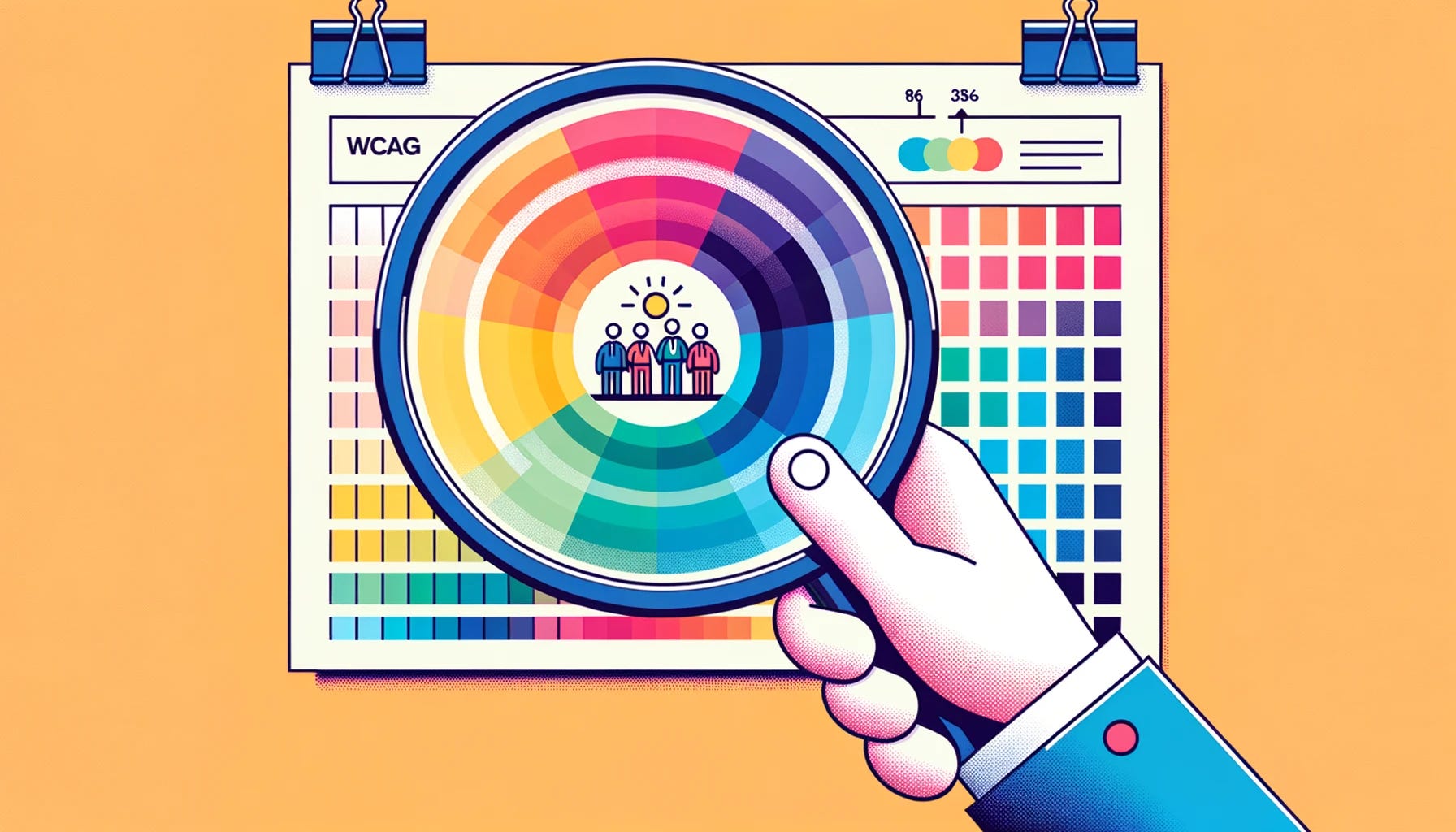
Colour contrast is more than a design choice in the digital realm; it’s a pillar of usability for websites and web applications. It shapes how users perceive content, engage with interfaces, and ultimately navigate the online world. Beyond aesthetics, colour contrast is a key player in readability and comprehension, crafting a user-friendly environment that eases navigation and interaction.
The stakes are high for individuals with visual impairments. People with low vision or colour vision deficiencies depend heavily on contrast to read text and captions, interact with buttons, and navigate through web pages. Without adequate contrast, a website could turn into a confusing maze for this group. And as the global populace ages, reduced contrast sensitivity becomes an ever increasing concern.
But the ripple effect of colour contrast goes beyond visual impairments. Colour contrast also plays a crucial role in the user experience of the general population. In conditions of glare, reflection, or low light, high contrast is vital to maintain readability and ease of use. Well-contrasted colours reduce eye strain and promote better understanding and retention of the content, enhancing the user experience for all users, regardless of their visual acuity.
Whilst having far-reaching and deep impacts on disabled people, it’s not something given a lot of thought by designers and developers. With the current mainstream testing method supported by WCAG2.0–2.2 becoming a hinderance for designers a larger shift should be made to W3C’s APCA to provide a more inclusive experience.
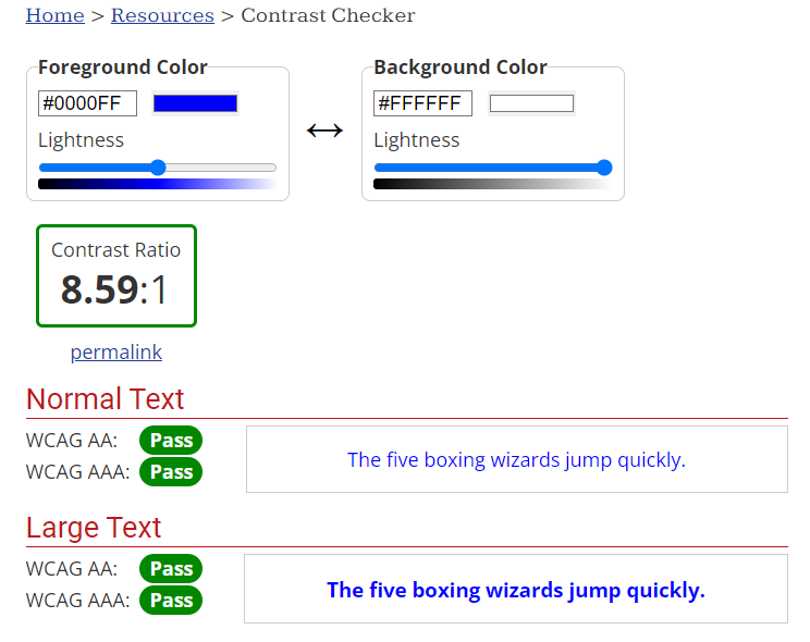
Traditionally, the Web Content Accessibility Guidelines (WCAG) have been the go-to standard for evaluating colour contrast. It employs a formula that compares the relative luminance of text and background colours. At its core, WCAG compares the relative luminance of text to their background colour. It does this by employing a formula denoted as (L1 + 0.05) / (L2 + 0.05), where L1 and L2 represent the relative luminance of the lighter and darker colours respectively.
WCAG’s formula being incredibly easy to figure out does not have much of a material impact. Like all good developers we just use a tool — WebAIM offers a tool for checking results for testing.
The widespread use of this formula does however allude to a larger problem in technology — creating systems that benefit the ease of the develop, instead of the end user — whilst the WCAG formula is simple it overlooks a number of real-world factors impacting users:
-
The diversities of screen technologies; on the digital stage where colour plays a pivotal role, the formula doesn’t account for the disparities in colour rendering between varying displays like OLED and CRT monitors.
-
Individual differences in vision; vision deficiency is a spectrum and there are at least 7 distinct variations of colour vision deficiency alone. A colour pair that appears clear and contrasting to one individual might be indistinct to another.
-
Real world conditions; the formula doesn’t adjust for real-world reading conditions, be it glaring sunlight, a dimly lit room or a damaged/dirty device.
It also causes issues for false positives, particularly when it comes to dark mode:
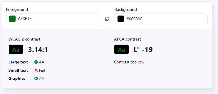
Enter the Advanced Perceptual Contrast Algorithm (APCA), a newer method that holds much promise for real-world applications of colour contrast evaluation. Developed by the W3C, APCA considers several factors including spatial frequency, ambient light, and the viewer’s age.
Whilst WCAG is something you encounter in your first algebra class the APCA formula is a quite literally a series of functions. The full algorithm can be found on the APCA W3C Github Repo.
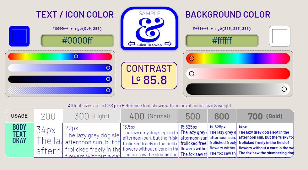
import { APCAcontrast, reverseAPCA, sRGBtoY, displayP3toY, adobeRGBtoY, alphaBlend, calcAPCA, fontLookupAPCA } from 'apca-w3';LightText(Lc)= abs( (background_luminance0.65) - (text_luminance0.62) ) * 100+2.7
The final algorithm leaves you with a number between 0 and 106 for dark text and 0 to -108 for light text. Whilst ±75 is considered equivalent to WCAG2 Level AAA and ±60 is usually equivalent to Level AA, you can use the APCA docs to contextually achieve your desired result with ±15 usually being invisible for most people.
Whilst noticeably more complicated it also provides a plethora of real-world benefits:
-
Perceptual Accuracy; It aims to closely mirror human contrast perception, allowing for colour combinations that actually work well in practice but are considered incorrect under WCAG — this particularly impacts dark mode.
-
Contextual Evaluation; It takes into account spatial properties like font weight and text size, which makes the evaluation more robust and realistic.
-
**Scalable Contrast Values; **The full range of contrast values and varying bronze, silver and gold levels aids designers in making more informed colour choices.
Considering the average developer and designer uses testing tools for colour contrast, the learning curve associated with this formula is moot when it comes to application in the real world, with plenty of testing tools existing:
Unfortunately, regardless of developer and designer adoption the glaring issue with APCA adoption is the lag in legislation. Current legal frameworks governing web accessibility are still tethered to WCAG standards. They do not necessarily allow for the intent of the criteria to be achieved above the wording of the criteria.
This means despite its clear benefits, implementing APCA requires a delicate balance. It’s advisable for developers and designers to tread carefully and research local requirements appropriately, ensuring you remain compliant with existing laws.
As we tread the path towards more inclusive digital landscapes, the collaboration between designers, developers, and more importantly, individuals with disabilities cannot be emphasized enough. By fostering a dialogue with each other and with disabled individuals, the tech community can garner invaluable insights into the practical implications of digital accessibility. It’s through this triad of perspectives that real-world solutions for broader web accessibility issues can be unearthed.
incluseum.digital is making accessibility actually accessible. We are offering free articles, tools and courses, just like the one you’re reading right now! Make sure to sign up for our newsletter and receive these straight to your inbox!